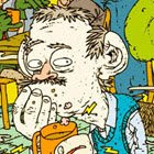
LIGHT BOMB / PIXPONG Eindhoven from Jeroen Erosie on Vimeo.
The theme was "light" and reminded me of paint-bombs used to throw at office buildings that are made of lightbulbs. So the white spots are meant for the building, the black "light bombs" were meant to be against the light matrix. It plays with my mixed feelings about the city-marketing of Eindhoven "City of Light", or, well...city marketing in general.


